M7 Admissions
As a brand designer at Tempo Digital, I worked on the rebrand of M7A, an MBA admissions consulting firm ready to break away from the industry’s rigid, academic tone. While most competitors leaned into prestige and formality, their visual identities were nearly indistinguishable—many even using the same color palettes. We saw an opportunity to create something bold, inviting, and confidence-boosting for a new generation of MBA applicants.
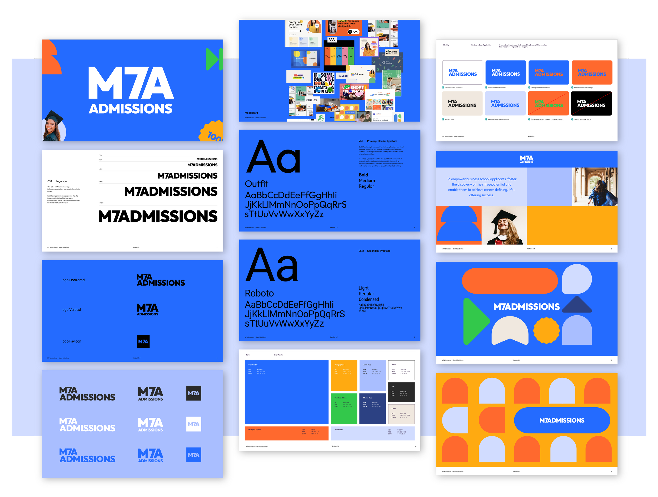
Through a design sprint and market analysis, we redefined M7A’s positioning, focusing on its core strength—helping applicants build confidence in their journey. We introduced a vibrant, energetic color system and modern typography that feels as dynamic and supportive as M7A’s approach. The result is a brand that feels approachable yet professional, guiding applicants through the admissions process with clarity and optimism.
Designed with scalability in mind, the identity is built to grow, seamlessly expanding into other admission markets. With this transformation, M7A isn’t just another admissions service—it’s a brand that empowers applicants to own their story and dream bigger.
Brand & Visual Identity
Market Research
Logo
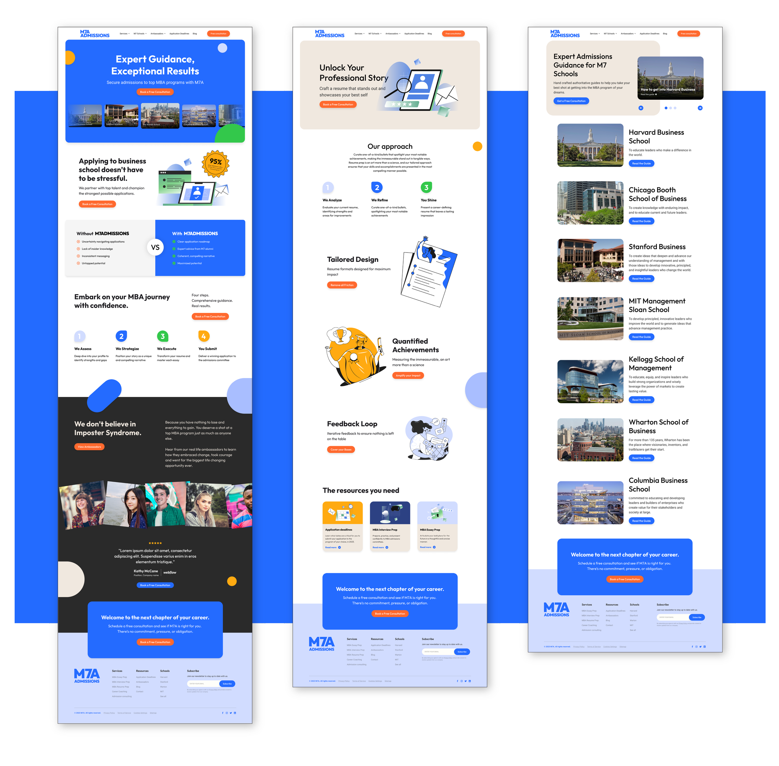
Website design

Market Analysis of Competitors Brand Colors

Visual Guide on Brand Strength

Chart Comparing Brand Positioning
