Higher Ground
Where connection feels impossible, Higher Ground makes it seamless. Designed for those venturing beyond cellular coverage, its compact satellite devices ensure communication when it matters most. The flagship SatPaq transceiver pairs with smartphones, turning the unreachable into a reliable lifeline.
As a brand designer for Tempo Digital, we reimagined Higher Ground’s identity to reflect resilience and exploration. A horizon-based logo captures stability and clarity, while earth tones and clean typography ground the brand in trust and functionality. Inspired by rugged landscapes, the design speaks to adventurers, professionals, and first responders alike.
The rebrand positions Higher Ground as a clear beacon of reliability, ensuring that no matter how remote the journey, connection is never out of reach.
Brand & Visual Identity
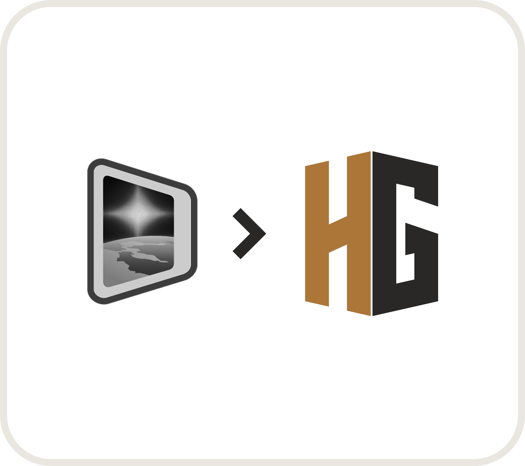
Logo
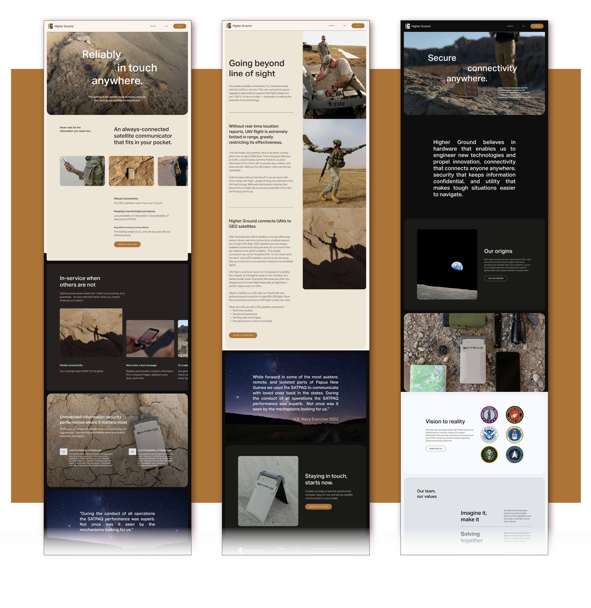
Website design


Creating a Secure Connection
Through a design sprint, we uncovered Higher Ground’s core mission—not just exploration, but security, reliability, and connection in places where traditional communication fails. What began as an identity centered around adventure evolved into one focused on strength, stability, and trust—the essential pillars of the brand.
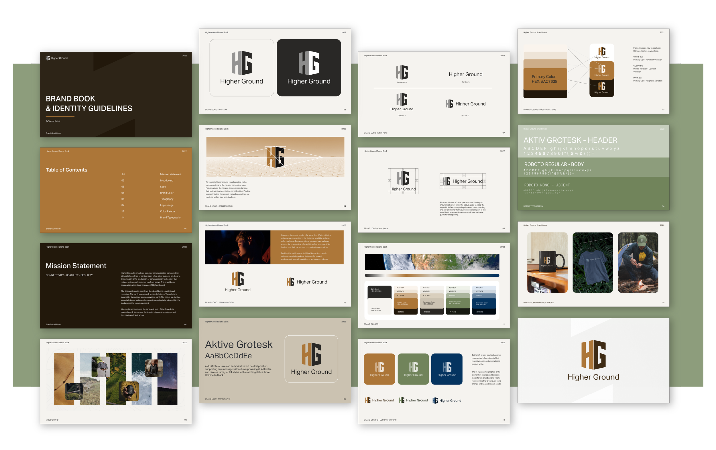
This shift led to a strong, unfussy design that prioritizes clarity and confidence. We chose Aktiv Grotesk for its utilitarian strength—authoritative yet approachable, ensuring messages come through without noise or distraction. The color palette, inspired by Earth from a satellite’s perspective, is grounded in deep charcoal and Raw Sienna—tones that represent both the stability of the terrain below and the warmth of a fire in the distance. A beacon of safety, fire has long been a signal of gathering, rest, and connection, mirroring Higher Ground’s role in keeping people linked when it matters most.
The horizon-inspired logo was designed with vantage points and light in mind, reflecting how gaining higher ground offers both clarity and perspective. Built from natural geometries, the mark balances strength and adaptability, reinforcing the idea that communication should be seamless, no matter the terrain.
The result is a brand that feels as steadfast and resilient as the technology itself—ensuring connection when it’s needed most and standing as a guiding light in uncertain terrain.
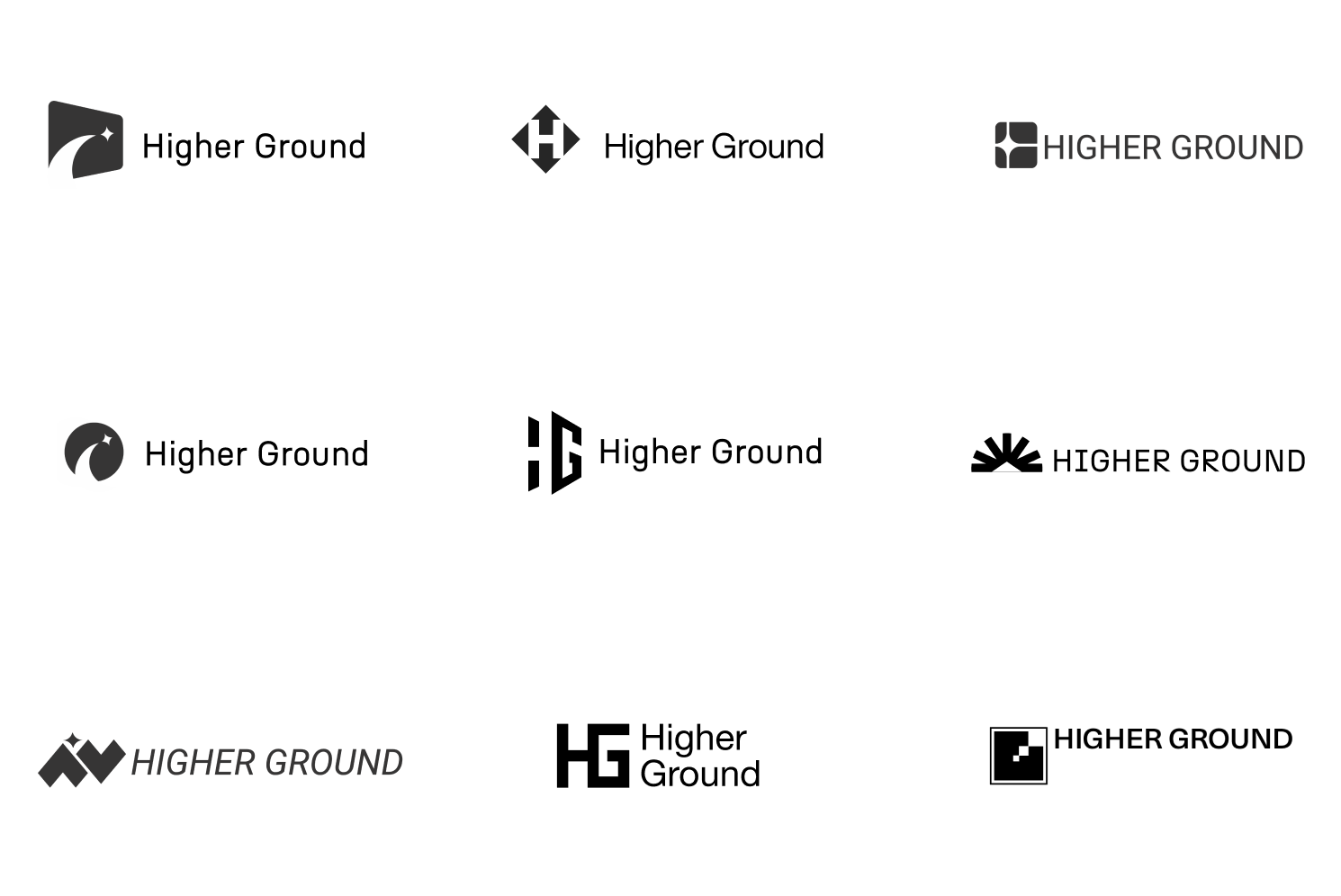
Logo Drafts
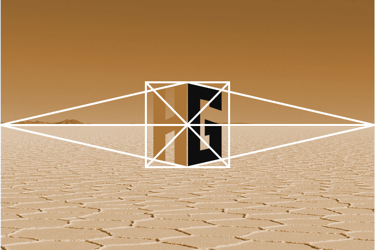
Vantage Point Study
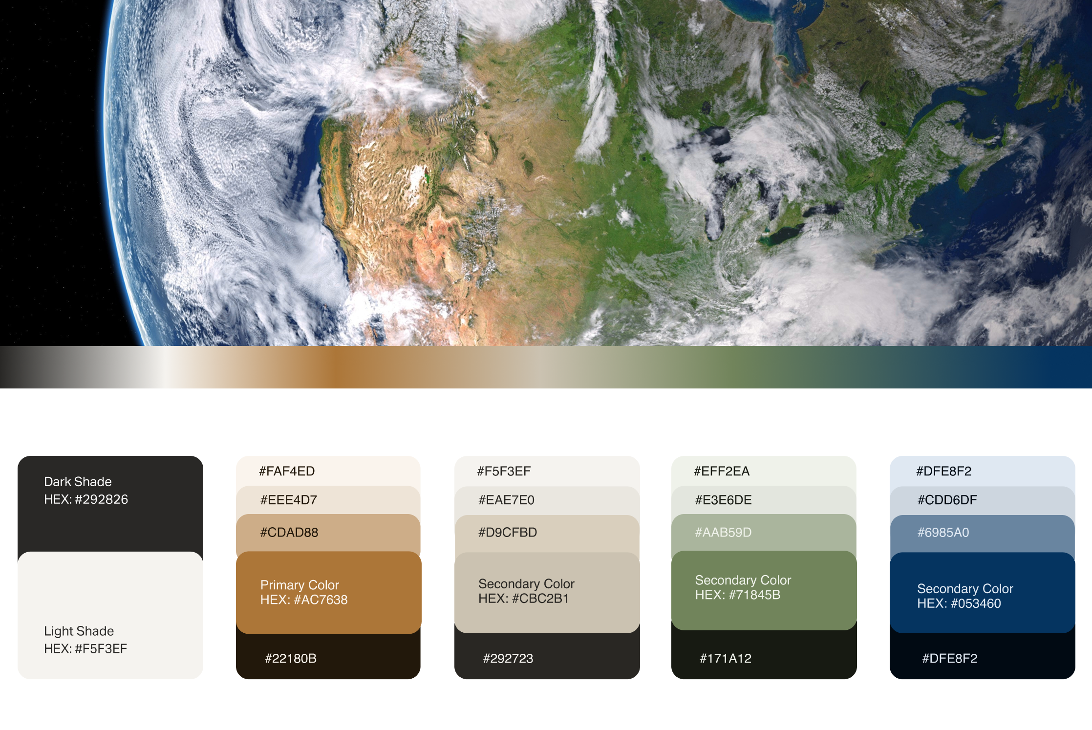
Color Palette Origins

Primary Color Focus

